📘 Full Explanation of the R Code
🧩 Line 1: Define subject names
subjects <- c("Mathematics", "Physics", "Chemistry")What it does:
- The **
c()** function in R combines values into a vector. - Here, we are creating a **character vector** containing the names of the three subjects.
- This vector will be used later to **label the bars** in the bar plot.
Explanation of components:
subjects→ variable name (vector of subject labels)<-→ assignment operator in R (assigns the value on the right to the variable on the left)"Mathematics","Physics","Chemistry"→ strings representing subject names
So after this line,
subjects=["Mathematics", "Physics", "Chemistry"].
📊 Line 2–10: Create the bar plot
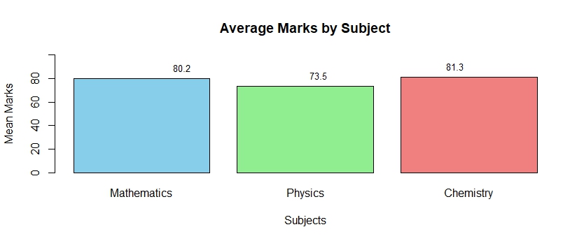
barplot(
  mean_marks1,
  names.arg = subjects,
  col = c("skyblue", "lightgreen", "lightcoral"),
  main = "Average Marks by Subject",
  xlab = "Subjects",
  ylab = "Mean Marks",
  ylim = c(0, 100)
)
Function Overview:
barplot() is a **base R function** that creates a bar chart (vertical or horizontal) from numeric data.
Argument-by-argument breakdown:
-
mean_marks1- The main numeric vector that you want to plot.
- Each value in this vector represents the **mean marks** for one subject.
- Example:
mean_marks1 <- c(80.16667, 73.5, 81.33333)
-
names.arg = subjects- This argument tells R what names to put **under each bar**.
- It uses the previously defined
subjectsvector. - So each bar will be labeled as *Mathematics*, *Physics*, and *Chemistry*.
-
col = c("skyblue", "lightgreen", "lightcoral")- Specifies colors for the bars.
- Each color corresponds to a bar (in order).
- You can use named colors (like
"red","blue") or hexadecimal color codes (like"#FF5733").
-
main = "Average Marks by Subject"- Sets the **title** at the top of the plot.
- It helps describe what the graph represents.
-
xlab = "Subjects"- Adds a **label on the x-axis** (horizontal axis).
-
ylab = "Mean Marks"- Adds a **label on the y-axis** (vertical axis).
-
ylim = c(0, 100)- Defines the **range of the y-axis**.
- Here it starts at 0 and ends at 100, ensuring all marks fit within the visible range.
- Helps keep the scale consistent (since marks are usually out of 100).
🏷️ Line 11–17: Add labels above the bars
text(
  x = seq_along(mean_marks1),
  y = mean_marks1,
  label = round(mean_marks1, 1),
  pos = 3,
  cex = 0.8
)
Function Overview:
text() adds **text annotations** to a plot — in this case, to display the exact mean values above each bar.
Argument breakdown:
-
x = seq_along(mean_marks1)seq_along()generates a sequence of numbers from 1 to the length ofmean_marks1.- Example: if there are 3 means, it returns
1, 2, 3. - These are the **x-coordinates** (horizontal positions) where each text label will appear — directly above each bar.
-
y = mean_marks1- These are the **y-coordinates** (vertical positions) for the text labels.
- Each label will be placed above the corresponding bar height.
-
label = round(mean_marks1, 1)- Specifies the text to display.
round(mean_marks1, 1)rounds each mean value to 1 decimal place for cleaner display (e.g., 81.3 instead of 81.33333).
-
pos = 3- Determines where the text is placed relative to the coordinates.
pos = 3means **above** the specified (x, y) point.- Other possible values:
1: below2: left3: above4: right
-
cex = 0.8- Controls the **size of the text**.
1is the default size; smaller values like0.8make the text slightly smaller and less cluttered.
✅ Final Output
When you run the entire block:
- Three bars appear — one each for Mathematics, Physics, and Chemistry.
- Each bar has a different color.
- The y-axis shows mean marks from 0 to 100.
- The top of each bar shows the numeric mean value (rounded to one decimal).
💡 Summary Table
| Function | Purpose | Key Arguments |
|---|---|---|
c() |
Combine values into a vector | "Mathematics", "Physics", "Chemistry" |
barplot() |
Draws the bar chart | names.arg, col, main, xlab, ylab, ylim |
text() |
Adds text to plot | x, y, label, pos, cex |
seq_along() |
Generates numeric sequence 1:n | Used to align text with bars |
round() |
Rounds numeric values | Used to simplify numeric labels |